Overview
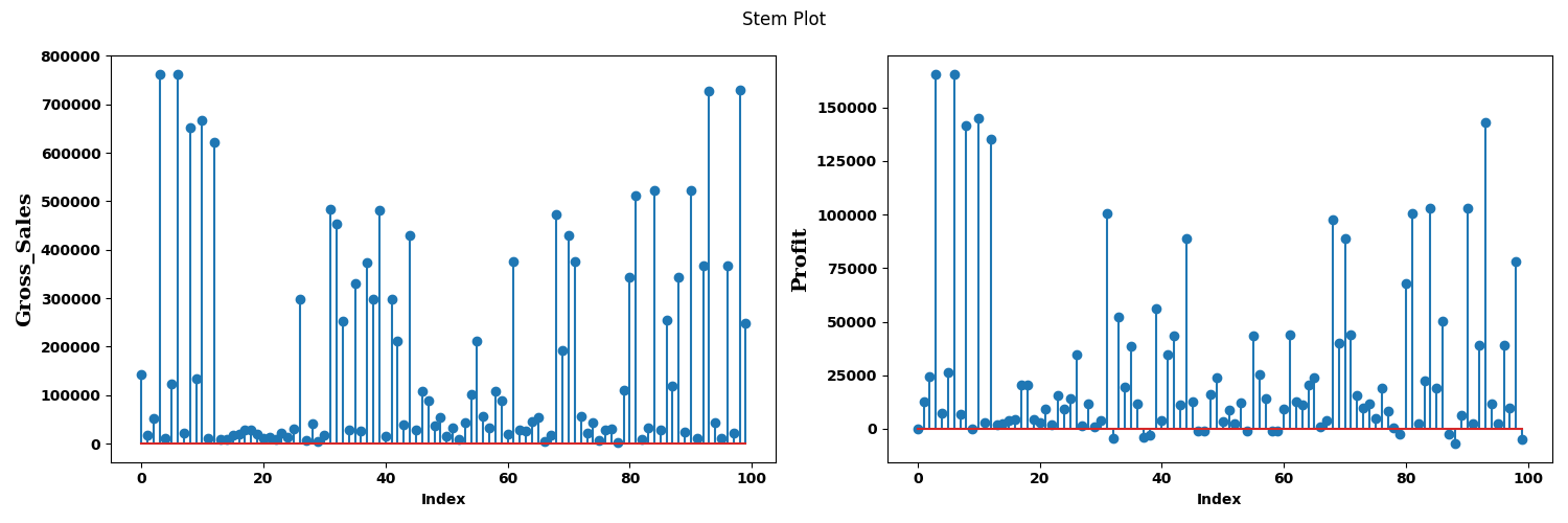
The Stem Plot node is a statistical-plot node in a Weave Workflow that represents numerical data as stems topped with markers, rising from a baseline. A stem plot, also known as a stem-and-leaf plot, is a simple method of representing numerical data while maintaining the original data values. A stem plot is similar to a histogram but provides more detailed information about individual data points.
The node sits under the Statistics tab, distinct from the transformation nodes, and produces a visual output rather than a transformed table. Configuration uses the multi-field selection popup (Select Fields for Y axis), the same pattern as the Bar Plot node: the selected fields are plotted on the Y axis and the X axis is the row index.
Note: “Workflow” is the in-UI term for what some Weave documentation calls a pipeline. This reference uses “Workflow.”


When to use it
- Showing individual data point values while preserving their order along an index.
- Seeing point-by-point structure that a histogram’s binning would hide.
- Comparing the shape of one or more fields across the same index.
Configuration
| Step | Description |
| Select | Opens the Stem Plot popup listing the columns in the upstream data. |
| Select All | Selects every column in the popup. |
| Column checkboxes | Choose the fields to plot; each is rendered as a stem plot. |
| Apply | Commits the field selection. |
Chart elements
| Element | Description |
| Y axis | Shows the values of the selected field. |
| X axis (Index) | Shows the row index. |
| Stems | Vertical lines from the baseline to each data point. |
| Markers | A dot at the top of each stem marking the value. |
| Baseline | The horizontal line the stems rise from. |
Key behaviors
Statistical-plot node. Stem Plot is found under the Statistics tab, separate from the transformation nodes, and outputs a visualization rather than a modified data table.
Field selection drives the Y axis. The selected fields are plotted on the Y axis against the row index, the same configuration pattern as the Bar Plot node.
Preserves individual points. Unlike a histogram, which aggregates into bins, the stem plot shows each data point as its own stem, retaining the original values.