Overview
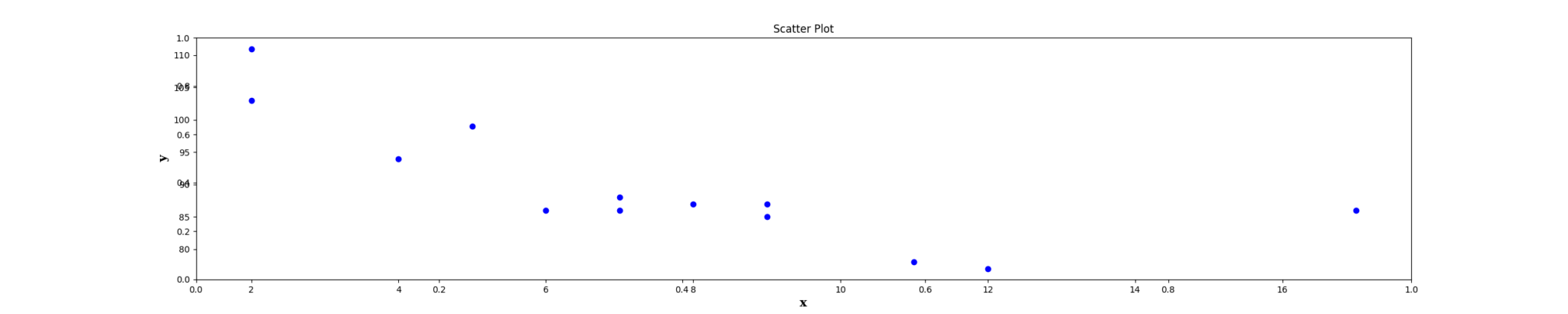
The Scatter Plot node is a statistical-plot node in a Weave Workflow that displays individual data points as dots on a two-dimensional plane. It plots one column on the X axis against one column on the Y axis without connecting the points. The node sits under the Statistics tab, distinct from the transformation nodes, and produces a visual output rather than a transformed table.
Like the Line Plot node, it is configured with two axis dropdowns — X and Y — each choosing a single column; unlike Line Plot, the data points are shown as separate dots and are not joined by lines.
Note: “Workflow” is the in-UI term for what some Weave documentation calls a pipeline. This reference uses “Workflow.”


When to use it
- Examining the relationship or correlation between two numerical columns.
- Spotting clusters, gaps, or outliers in a two-column distribution.
- Plotting raw X-versus-Y points without implying a sequence between them.
Configuration
| Field | Description |
| X | Dropdown that selects the column for the horizontal (X) axis. |
| Y | Dropdown that selects the column for the vertical (Y) axis. |
Key behaviors
Statistical-plot node. Scatter Plot is found under the Statistics tab, separate from the transformation nodes, and outputs a visualization rather than a modified data table.
Axis-dropdown configuration. Configuration is two single-column dropdowns (X and Y), the same pattern as the Line Plot node.
Unconnected points. Each data point is drawn as a dot at its X and Y position with no connecting lines, distinguishing it from the Line Plot node.