Overview
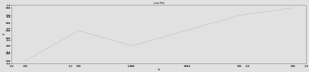
The Line Plot node is a statistical-plot node in a Weave Workflow that displays data points as individual markers connected by straight lines. It plots one column on the X axis against one column on the Y axis. The node sits under the Statistics tab, distinct from the transformation nodes, and produces a visual output rather than a transformed table.
Unlike the other statistical-plot nodes, which select a set of columns from a popup, the Line Plot node is configured with two axis dropdowns — X and Y — each choosing a single column.
Note: “Workflow” is the in-UI term for what some Weave documentation calls a pipeline. This reference uses “Workflow.”


When to use it
- Showing how one column’s values change across another, such as a measure over an ordered sequence.
- Visualizing a trend or trajectory between two columns.
- Plotting a single X-versus-Y relationship as a connected line.
Configuration
| Field | Description |
| X | Dropdown that selects the column for the horizontal (X) axis. |
| Y | Dropdown that selects the column for the vertical (Y) axis. |
Key behaviors
Statistical-plot node. Line Plot is found under the Statistics tab, separate from the transformation nodes, and outputs a visualization rather than a modified data table.
Axis-dropdown configuration. Configuration is two single-column dropdowns (X and Y) rather than the multi-column selection popup used by the other plot nodes.
Points connected by lines. Data points are drawn and connected with straight lines, showing the Y column’s movement across the X column.