Overview
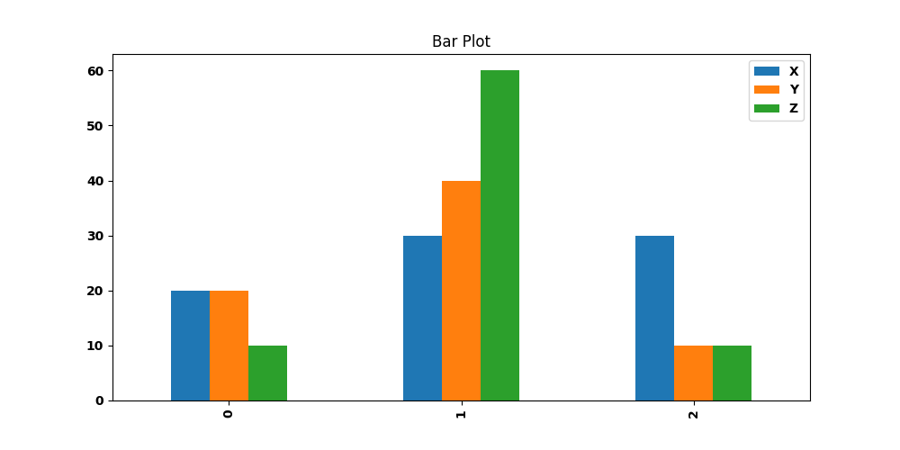
The Bar Plot node is a statistical-plot node in a Weave Workflow that displays selected fields as bars. The fields chosen in the Select Fields popup form the Y-axis series; the Y axis shows their values and the X axis shows the row positions, with one bar per field at each position. The node sits under the Statistics tab, distinct from the transformation nodes, and produces a visual output rather than a transformed table.
Configuration uses the multi-field selection popup (Select Fields for Y axis) rather than the X/Y axis dropdowns of the Line Plot and Scatter Plot nodes.
Note: “Workflow” is the in-UI term for what some Weave documentation calls a pipeline. This reference uses “Workflow.”


When to use it
- Comparing the values of one or more fields as bars.
- Plotting several fields side by side as grouped bars at each row position.
- Reviewing field magnitudes visually before further analysis.
Configuration
| Step | Description |
| Select | Opens the Bar Plot popup listing the columns in the upstream data. |
| Select All | Selects every column in the popup. |
| Column checkboxes | Choose the fields to plot on the Y axis; each becomes a bar series. |
| Apply | Commits the field selection. |
Chart elements
| Element | Description |
| Y axis | Shows the values of the selected fields. |
| X axis | Shows the row positions where the columns are grouped. |
| Grouped bars | One bar per selected field at each X-axis position. |
| Legend | Identifies each selected field by name. |
Key behaviors
Statistical-plot node. Bar Plot is found under the Statistics tab, separate from the transformation nodes, and outputs a visualization rather than a modified data table.
Field selection drives the Y axis. The selected fields become the bar series plotted on the Y axis; the X axis shows the row positions. This differs from Line Plot and Scatter Plot, which take an explicit X and Y column.
Grouped bars. When multiple fields are selected, their bars are drawn together at each X position, distinguished by the legend.