Overview
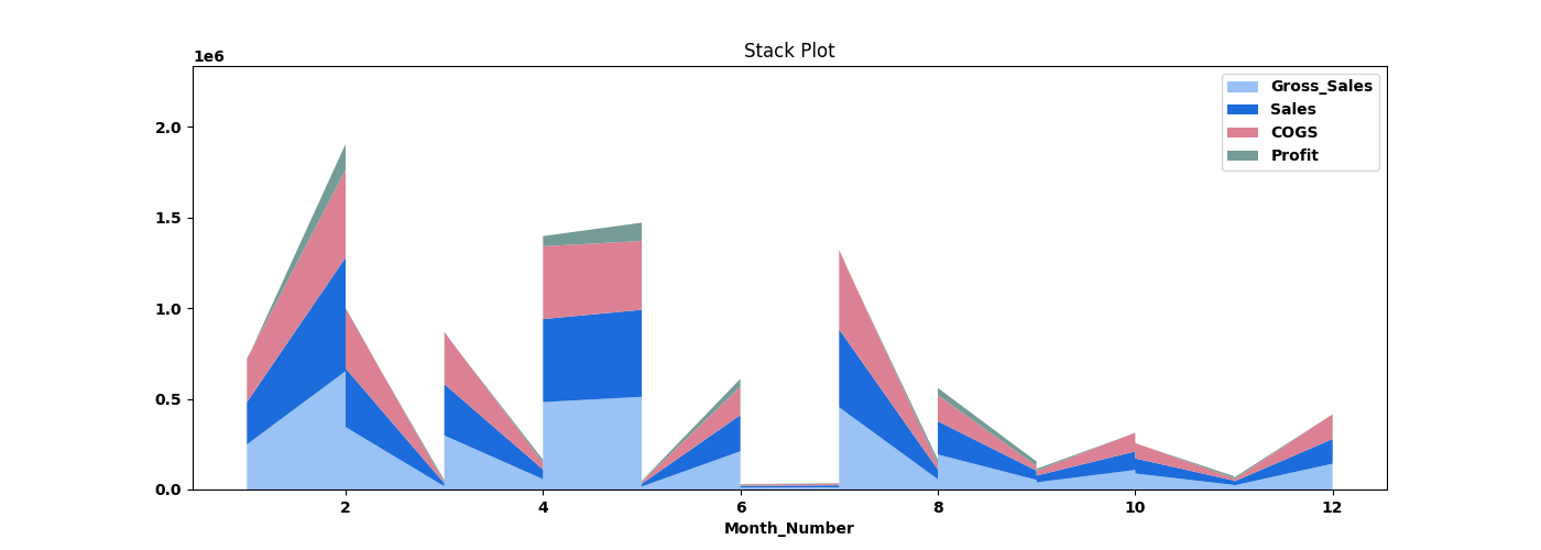
A stack plot, also known as a stacked area plot or stacked line plot, is a type of data visualization that displays multiple data series as layers stacked on top of each other, creating a cumulative effect. Each layer represents a different data category or subgroup, and the height of the stack at any given point represents the combined value of all the layers at that point. The node sits under the Statistics tab, distinct from the transformation nodes, and produces a visual output rather than a transformed table.
Configuration combines a single Select X axis dropdown with a multi-field Select Fields popup for the Y axis. The X column sets the horizontal axis; each selected Y field becomes a stacked layer.
Note: “Workflow” is the in-UI term for what some Weave documentation calls a pipeline. This reference uses “Workflow.”


When to use it
- Showing how several series accumulate to a total across an X axis.
- Comparing each series’ contribution to the whole at each X position.
- Visualizing part-to-whole change over an ordered column such as time or days.
Configuration
| Field | Description |
| Select X axis | Dropdown that selects the single column for the horizontal (X) axis. |
| Select Fields | Opens the Stack Plot popup; the checked fields become the stacked Y-axis layers. |
| Select All | Selects every column in the field popup. |
| Apply | Commits the field selection. |
Key behaviors
Statistical-plot node. Stack Plot is found under the Statistics tab, separate from the transformation nodes, and outputs a visualization rather than a modified data table.
One X axis, many Y layers. Configuration pairs a single X-axis dropdown with a multi-field selection, distinct from the X/Y-only nodes (Line, Scatter, Step) and the Y-only nodes (Bar, Stem).
Cumulative stacking. The selected fields are layered, so the top edge of the stack at each X position represents the sum of all layers, and each band shows an individual field’s value.