Overview
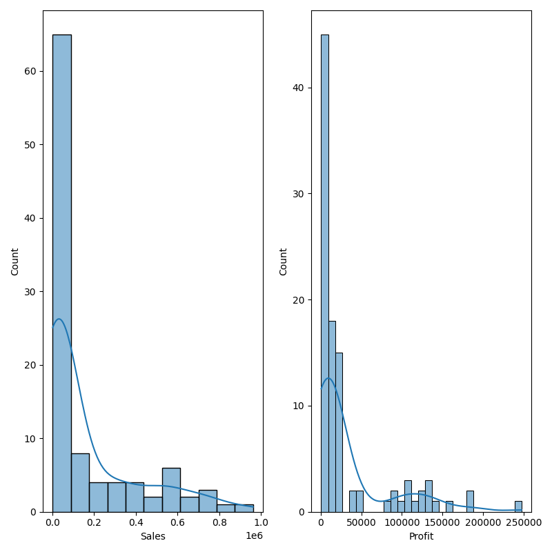
The Histogram node is a statistical-plot node in a Weave Workflow that shows the frequency distribution of selected columns. Like a bar chart, it plots the frequency of value occurrences across a continuous data set by grouping values into bins and counting them.
The node sits under the Statistics tab, distinct from the transformation nodes, and produces a visual output rather than a transformed table. The node applies to the columns selected in the Histogram popup.
Note: “Workflow” is the in-UI term for what some Weave documentation calls a pipeline. This reference uses “Workflow.”


When to use it
- Examining how values in a numerical column are distributed.
- Spotting skew, peaks, or gaps in a continuous data set.
- Comparing the distribution shape of several columns side by side.
- Assessing whether a column is concentrated or spread out before further analysis.
Chart elements
| Element | Description |
| Bins (x-axis) | Ranges that the column’s values are grouped into. |
| Count (y-axis) | The number of values that fall in each bin. |
| Bars | One bar per bin, its height set by the count. |
| Density curve | A smoothed curve overlaid on the bars indicating the distribution shape. |
Configuration
| Step | Description |
| Select | Opens the Histogram popup listing the columns in the upstream data. |
| Select All | Selects every column in the popup. |
| Column checkboxes | Choose the columns to plot. |
| Apply | Commits the column selection. |
Key behaviors
Statistical-plot node. Histogram is found under the Statistics tab, separate from the transformation nodes, and outputs a visualization rather than a modified data table.
One chart per column. Each selected column is rendered as its own histogram, displayed alongside the others.
Frequency by bin. Values are grouped into bins and counted, so each chart shows where the column’s values concentrate across its range.