Overview
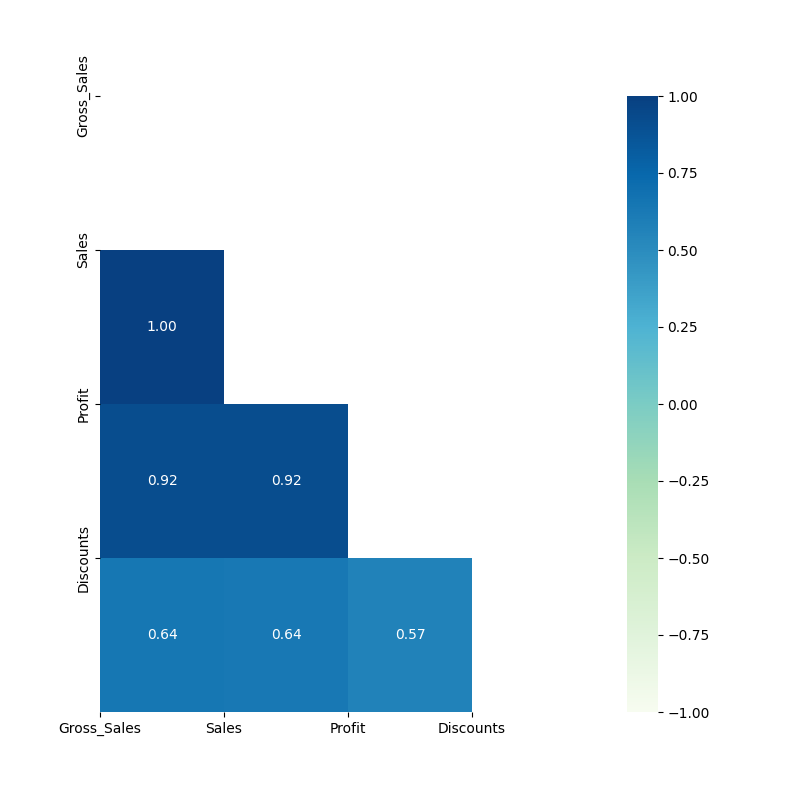
The Correlation node is a statistical-plot node in a Weave Workflow that measures the relationship between selected columns and renders the result as a correlation chart. Each pair of columns is scored by a correlation coefficient and displayed as a heatmap cell.
The node sits under the Statistics tab, distinct from the transformation nodes, and produces a visual output rather than a transformed table. The node applies to the columns selected in the Correlation popup.
Note: “Workflow” is the in-UI term for what some Weave documentation calls a pipeline. This reference uses “Workflow.”


When to use it
- Measuring how strongly two numerical columns move together.
- Scanning many columns at once for strong positive or negative relationships.
- Identifying redundant or highly related fields before modeling or further analysis.
- Exploring data relationships visually via a heatmap.
Coefficient interpretation
| Coefficient range | Interpretation |
| Near +1 | Strong positive relationship: the two columns increase together. |
| Near 0 | Little or no linear relationship. |
| Near -1 | Strong negative relationship: one column increases as the other decreases. |
Configuration
| Step | Description |
| Select | Opens the Correlation popup listing the columns in the upstream data. |
| Select All | Selects every column in the popup. |
| Column checkboxes | Choose the columns to include in the correlation. |
| Apply | Commits the column selection. |
Key behaviors
Statistical-plot node. Correlation is found under the Statistics tab, separate from the transformation nodes, and outputs a visualization rather than a modified data table.
Pairwise coefficients. The node computes a correlation coefficient for each pair of selected columns and presents them as a heatmap, with color and value encoding the strength and direction.
Numerical scope. Correlation is measured between numerical columns; the result reflects the numerical selections.