
Overview
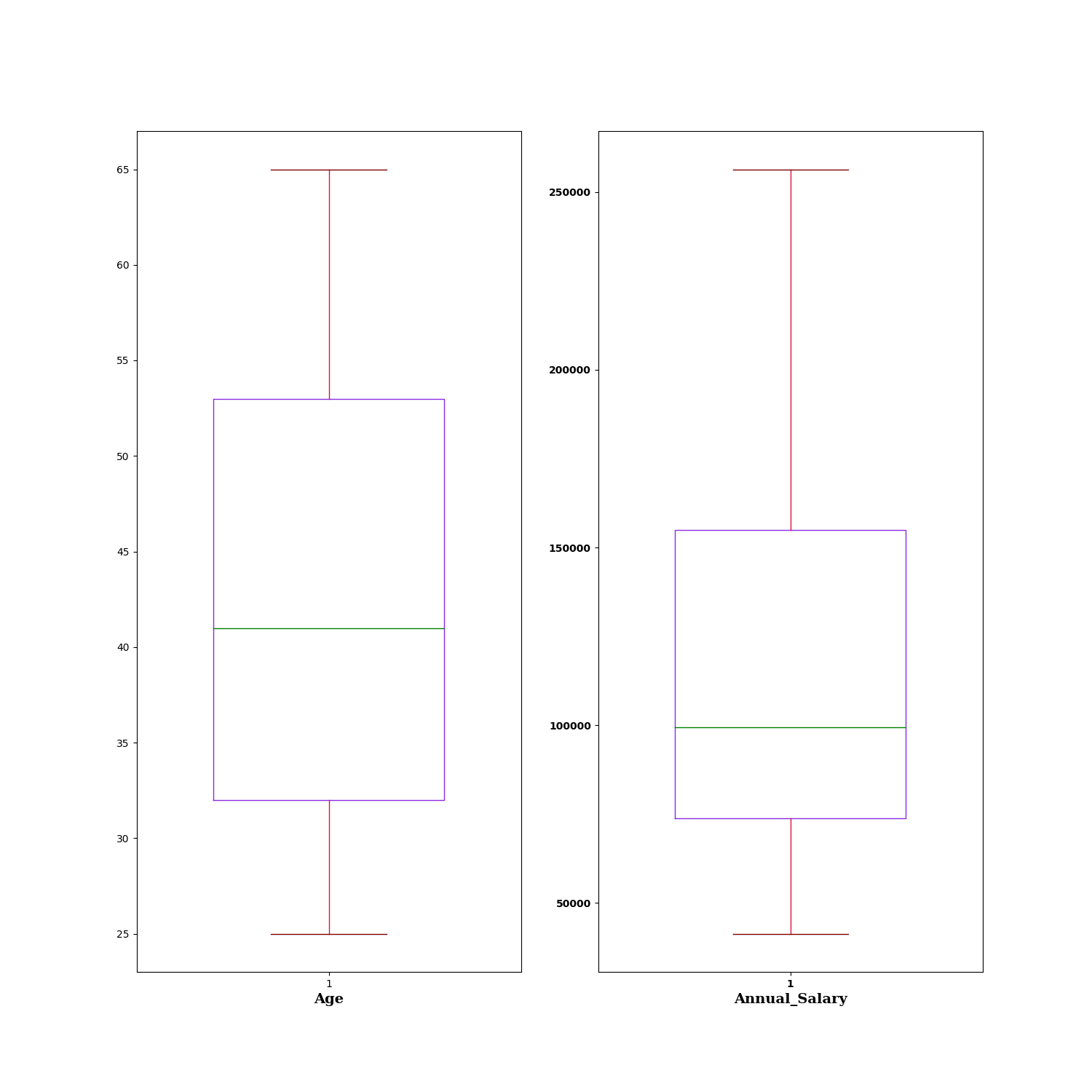
The Box Plot node is a statistical-plot node in a Weave Workflow that visualizes the distribution of selected numerical columns. Each column is rendered as a box plot summarizing its five-number summary — minimum, first quartile (Q1), median, third quartile (Q3), and maximum. The node sits under the Statistics tab, distinct from the transformation nodes, and produces a visual output rather than a transformed table.
The node applies to the columns selected in the Box Plot popup. It is intended for numerical columns.
Note: “Workflow” is the in-UI term for what some Weave documentation calls a pipeline. This reference uses “Workflow.”


When to use it
- Inspecting the spread and central tendency of numerical columns.
- Comparing the distribution of several numerical columns side by side.
- Identifying the median, quartiles, and range of a column at a glance.
- Spotting skew or wide spread before further transformation or analysis.
Five-number summary
Each box plot represents a column through five values:
| Element | Description |
| Minimum | The lowest value, shown as the lower whisker. |
| Quartile 1 (Q1) | The 25th percentile, shown as the bottom of the box. |
| Median | The 50th percentile, shown as the line within the box. |
| Quartile 3 (Q3) | The 75th percentile, shown as the top of the box. |
| Maximum | The highest value, shown as the upper whisker. |
Configuration
| Step | Description |
| Select | Opens the Box Plot popup listing the columns in the upstream data. |
| Select All | Selects every column in the popup. |
| Column checkboxes | Choose the numerical columns to plot. |
| Apply | Commits the column selection. |
Key behaviors
Statistical-plot node. Box Plot is found under the Statistics tab, separate from the transformation nodes, and outputs a visualization rather than a modified data table.
One plot per column. Each selected column is rendered as its own box plot, displayed alongside the others.
Five-number summary. Every plot encodes minimum, Q1, median, Q3, and maximum, giving the column’s distribution at a glance.